If you have an incredible service or product that should be delivered at regular intervals, a subscription landing page is what you need.
A subscription landing page will facilitate the signup process and encourage more prospects to subscribe to your package.
In this article, GemPages, the Shopify landing page experts, will walk you through how to create a profitable subscription landing page, and recommend some superb pages that you can learn from.
Let’s get cracking.
What is a subscription landing page?
‘Landing page’ is no longer an unfamiliar term. Merchants, marketers and bloggers exploit landing pages to convert visitors to leads and leads to paying customers.
A landing page is a stand-alone page on a website that delivers one consistent message over the entire page.
By the same token, a subscription landing page highlights the features of your subscription service urging visitors to start a free trial, book a demo or purchase a package.
A textbook subscription-centered landing page should tick all of the boxes below:
- Elaborate on how your subscriptions work.
- Put your unique selling points in the spotlight.
- Point out the superior nature of your products compared to your competitors.
The three points above are basically everything you need to include in your subscription landing page.
However, if you intend to accelerate the checkout process, adding an irresistible discount code can help.
Why is a subscription landing page important?
In any marketing program, a landing page has a significant impact on conversions but this does not necessarily mean sales. An effective landing page can be used to drive customers to subscribe to newsletters, leave a testimonial, or even share your brand with a friend.
Without a doubt, a landing page has a crucial role to play in infiltrating consumers through a process to educate them and convince them to consider purchasing your product.
Since the content of the whole page solely focuses on encouraging the audience to take further action, a subscription landing page will be a bridge to hook prospective customers and lead them to the final buying decision.
How to create a high-converting subscription landing page?
A subscription landing page needs a number of elements to be high-converting. The most lucrative subscription landing pages, however, all have one thing in common: clear and engaging content.
Let’s look at what makes a thriving subscription landing page.
Content
- Clear message
Focused and free of distractions, content plays a central role in converting audiences.
When a customer lands on your subscription page, they expect to be fully informed about your product, pricing, and how your subscription service works.
Check out 7 Types Of Pricing Strategies To Boost Subscriptions And Memberships Sales For Your Shopify Stores if you need help with your pricing strategy.
- Compelling CTAs
A call to action (CTA) is an element that urges visitors to sign up for a product. Once audiences click a CTA button, or follow a CTA, it directs them to the checkout page and provides payment information.
Follow the below points to make your CTA standout on your subscription landing page.
- Start with strong command verbs.
- Create a sense of urgency.
- Apply language that stirs up emotion.
- Deploy pop-ups to capture visitors’ attention.
- Social proof
Purchasing products online means taking a big leap of faith to pay for something you can’t physically interact with.
When a prospect is on the fence, deciding whether to subscribe to a product from your site or not, they tend to look at the opinions of others.
Testimonials or reviews help your target audiences to feel secure and drive them to complete a purchase.
Start building trust on your subscription landing page with four basic types of social proof.
- Case studies
Nothing is more convincing than insights from previous users. A case study shows that your items or service have/has effectively solved a customer’s pain point before. Ergo it can solve theirs too.
By showing the outcome, you create a sense of what success looks like for your customers.
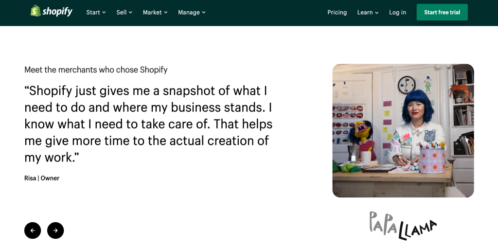
A giant of eCommerce, Shopify, has the same idea. A section on its homepage displays a few great case studies to influence a prospect’s buying decision.
Caption: Subscription landing page example
Alt-text: Screenshot of subscription landing page example
The same tactic can be applied to your subscription landing page for the same effect.
1. Testimonials
A short recommendation from your existing users is priceless too. A section exhibiting a collection of testimonials helps strengthen your brand credibility.
Recent research indicates that visitors are 31% more likely to make a purchase if a business has positive testimonials.
2. Reviews
Star ratings can also capture a consumer’s attention. If your subscription landing page contains a wall of text, adding colored stars and positive comments can be a great way to break up the monotony.
Forums and review sites are where you can easily extract reviews and opinions about your products or services. If you can’t find reviews of your products, posing a question on Quora or Reddit may help.
3. Brand stats
Data or numbers can have a significant impact on a customer’s mindset. You can improve your credibility with these figures and gain customers.
Some stats you could consider using are:
- Subscriber data (for example: ‘40,000 customers subscribe to this package’)
- Years of experience (for example: ‘with 5+ years in ….. industry.’)
- Ranges in geography (for example:,‘available in 30+ countries’)
Showing data on your subscription landing page can have the same impact on your visitors, and drive them to subscribe to your product.
● FAQs
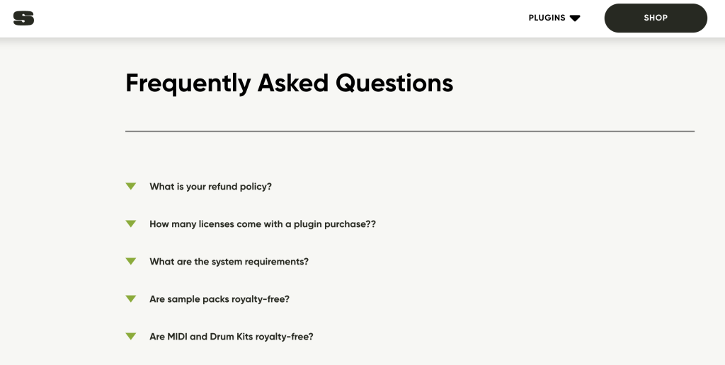
To minimize the chances of your prospects leaving the page for more information, attach a FAQ section to your subscription landing page. By using FAQs, you can solve a customer’s pain points and eliminate any confusion that prevents them from opting for your subscription package. Below, you can see Sauceware utilizes FAQs to clarify information. Don’t miss your chance to help prospects know more about you and your value through FAQs.
Caption: Subscription landing page example
Alt-text: Screenshot of subscription landing page example
Visuals
● Use a Stunning Design
In less than 30 seconds, a customer can form a solid opinion about your site and products and first impressions last. That’s why a huge investment of time and effort should be made in your subscription landing page design.
Even an experienced website creator can struggle to build a landing page from scratch. But don’t fret, GemPages is here to help. A stunning, high-converting and functional subscription landing page is just a click away.
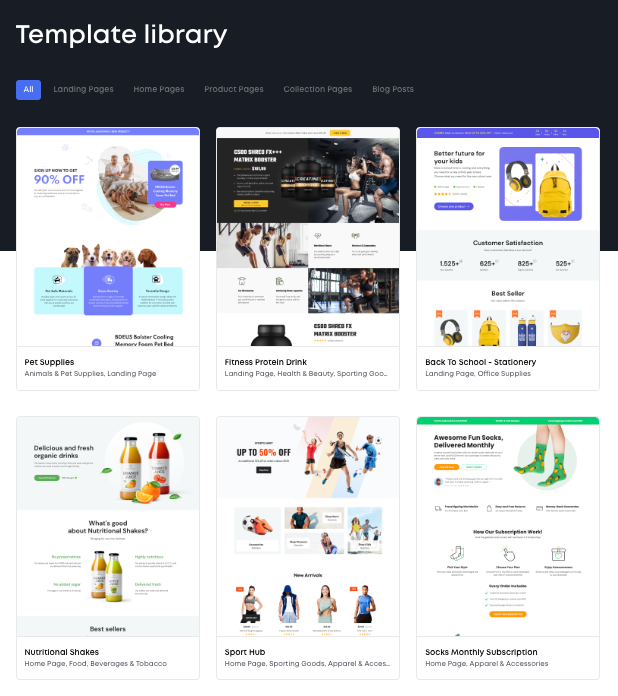
A reservoir of splendid templates covering every industry is available on the GemPages app.
Caption: Subscription landing page example
Alt-text: Screenshot of subscription landing page example
This app can give you a leg up as all templates are professional and responsive. Only drag-and-drop actions are required during the page creating process. This ensures your subscription landing page gets up and running in record time.
● High-resolution product images
Whereas a buyer at a brick-and-mortar store can touch and feel a product, an online consumer can only picture the items with photos on the website.
A survey by Salsify points out that 60% of consumers said they need three to four photos on average to decide to purchase a product online.
High-quality product images from a range of angles are then very important for driving conversions.
● Promotional videos
By providing promotional videos featuring how to use a product or how satisfied customers often feel after they have made a purchase, you may be able to shorten the amount of time they take to think about making a purchase.
Videos are processed up to 60,000 times faster than text alone. Therefore, it is a terrific element to include on your subscription landing page to convey more message with less text.
There is no limit to the types of videos you can post. A commercial, a testimonial video, or a how-to video are all good for subscription landing page visuals and conversions.
● Pop-ups
Special offers on your subscription landing page can turn up in the form of a pop-up to really stand out. An animated element on your page ensures that your customers see it and it increases the likelihood they will take action.
Hundreds of businesses benefit from pop-ups. It’s time for you to get the same result.
The bottom line
A well-optimized subscription landing page can be key to the success of your subscription business. Here are some suggestions to create a subscription landing page that converts:
- Deliver a clear message and use engaging CTAs to focus your customer’s attention on taking further action.
- Leverage social proof to build trust and strengthen brand credibility.
In terms of visuals, focus on these factors:
- Apply an elegant yet beautiful template to build your subscription landing page quickly and more effectively.
- Include high-quality product images to help customers visualize your items.
- Add video to your subscription landing page to diversify your content and reduce the time it takes to make a purchase.
- Grab your customer’s attention with pop-ups.
Conclusion
A subscription business can bring a myriad of benefits to you and your business.
To unlock the full potential of this business model, devoting time and effort to a subscription landing page is a must. Unquestionably, a secret weapon to build a landing page in the shortest time is to utilize GemPages page builder and its robust features.
No matter what types of subscription products and services you offer are, the combination of convincing content and visuals can do wonders for your subscription landing page. A transparent, engaging and easy to read webpage will provide your prospects with a broad picture of your subscription’s value and reasons to pick your packages.
FAQs
- What is a subscription landing page?
A subscription landing page is a landing page that centers on recurring products or services. This type of landing page is used to urge prospects to subscribe to a package.
- What should a subscription landing page include?
A subscription landing page should include all the necessary information about the subscription including: CTAs, promotional videos and product images.
Author bio: Taylor is a content writer at GemPages, fascinated by how changes are created through eCommerce. When he doesn’t write, you can find him making coffee and chilling with his cat.
