High performing eCommerce subscriptions share a secret: they know how to get customers to choose subscription plans on their eCommerce site without overwhelming them.
They’ve mastered this valuable tactic of making choices easy for customers. In this blog, we discuss seven strategies to guide customers to choose the right subscription plan.
Let’s get started!
A quick snapshot of concepts in this article
- Set a default plan using labels like “Most Popular” to reduce decision fatigue and guide customers toward the most common choice
- Use progressive disclosure. Show one recommended plan upfront and only reveal additional options if the customer asks to explore more
- Match plan frequency to product type using contextual, personalized recommendations instead of generic billing cycles
- Speak in consumption language, not billing language (e.g., “arrives before you run out” vs. “monthly subscription”)
- Add micro-copy near the subscribe button to proactively address common concerns like cancellation, skipping, or hidden fees
- Limit choices to 2–3 options. Too many plans cause abandonment (Hick’s Law)
- Make post-purchase changes easy with a self-serve subscriber portal, skip/pause options, and one-click frequency adjustments
7 strategies to get customers to choose the right eCommerce subscription plan
From using default recommendations to limiting plan options, make these effective strategies a part of your subscription plan selection guide.
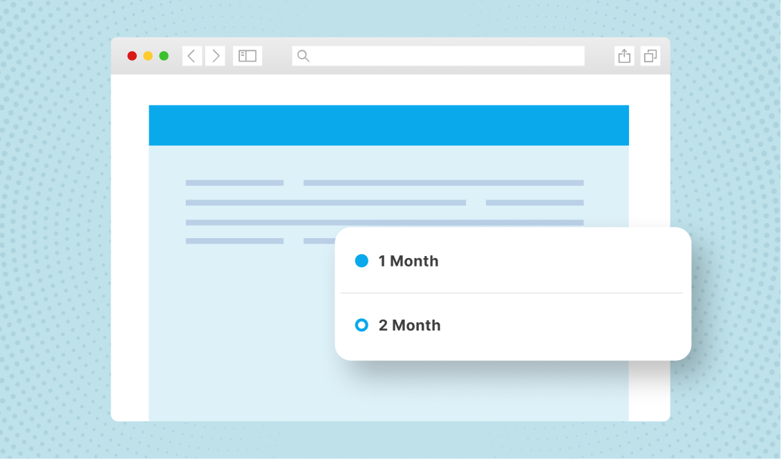
1. Use “default recommendations” based on majority behavior
Customers come across thousands of options when shopping. This causes decision fatigue – the inability to zero in and make a choice. One of the most effective UX strategies is to set a pre-selected default.
For example, instead of asking customers to select a plan from three or four options, highlight one as a clear choice. Make it the default choice unless customers select another plan.
Here are some tips to set default plan and why it works:
- Create labels, such as ‘Most popular’, ‘Best value’, or ‘Recommended for you’
- These labels remove cognitive load and add social proof
- Make the default plan the plan that most people choose
- When customers face too much choice, it reduces their mental energy
- By anchoring attention to one recommended plan, customers get an easy option
- Keep updating the default plan based on customer behavior
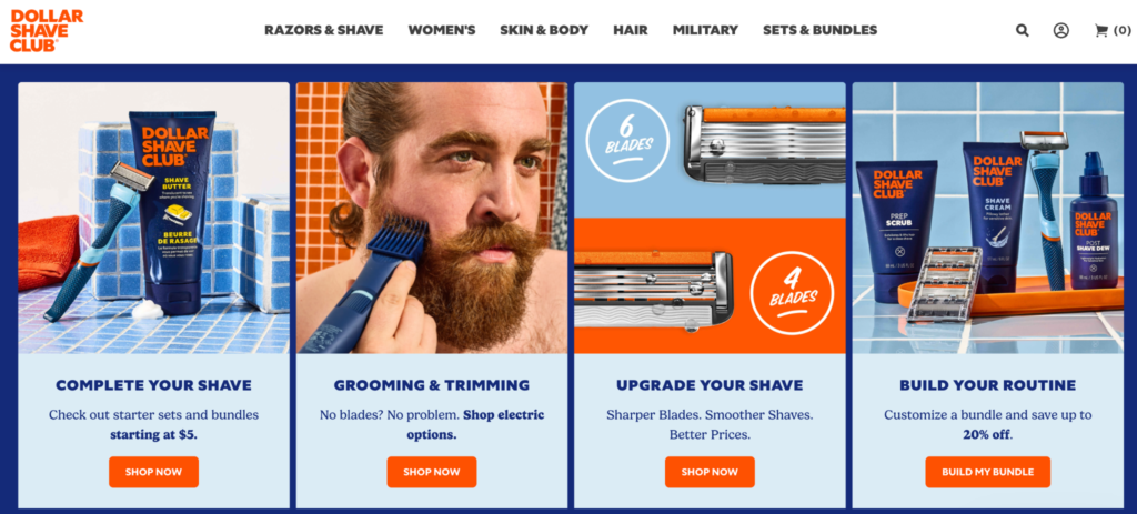
For example, Dollar Shave Club pre-selects their most popular razor bundle in the sign-up flow. When customers see it highlighted as ‘Most members choose’, it becomes an easier choice. This strategy has helped the brand increase the average order value at sign up.
2. Progressive disclosure instead of showing all options upfront
When you show all the subscription plan options at once, it can automatically look like a comparison matrix. And hence, customers start comparing plans. This is a mistake many eCommerce subscription brands make.
The solution: progressive disclosure. It is the UX design principle of revealing information gradually. In subscription pages, this means starting by displaying a single default plan and showing additional options when customers signal that they want to explore more.
Here’s how to implement it:
- Show one recommended plan prominently by default. This should be the most opted plan
- Add a small text link: ‘See all frequency options’ or ‘Customize your delivery schedule’
- Only expand the full plan selector when the customer clicks that link
- Keep the expanded view clean. Don’t show more than 2–3 alternatives with brief, scannable descriptions
For example, Athletic Greens shows an option between ‘One time’ and ‘Subscriber’ when customers first land on their product pages. When customers choose to subscribe, they see the recommended plan.
3. Contextual plan suggestions based on product type
The consumption cycle of products differs based on the product type. For instance, the consumption of a bottle of vitamin supplements is different from that of a bottle of shampoo.
Treating every product the same way with a weekly, monthly, or quarterly frequency can increase decision problems for customers. That is where contextual recommendations can help.
Here’s what you can do to help customers easily choose subscription plans in your eCommerce store.
- Understand customer needs and plan subscription frequencies
- Add a quiz to understand customer needs before recommending subscription plan options
- Create personalized frequency recommendations based on customer segmentation
- Audit every subscribable SKU in your catalog, map the consumption cycle, and set a default cadence in your subscription management app
- Revisit this every quarter by tracking churn, skip, pause, etc.
4. Translate plans into real-world usage language
When customers choose eCommerce subscription plans, they do not think in billing cycles; they think in consumption cycles. For instance, when customers see ‘Monthly Subscription – $50 per month’, they think about the billing frequency.
You can tackle this psychological barrier by using the right language and wording the offer correctly. Hence, instead of writing ‘Monthly delivery’, write ‘Arrives every 30 days, perfectly timed when you run out.’
Here are some subscription UX best practices:
- Frequency label: ‘Every 30 days’ (more tangible than “monthly”)
- Usage translation: ‘Lasts approximately 4 weeks based on 1 serving/day’
- Replenishment trigger: ‘Arrives before you run out’
- Flexibility reminder: ‘Adjust your next delivery date anytime’
What’s the psychological principle at play?
When customers can visualize themselves receiving the product from you just as they’re finishing the previous one, the subscription feels intuitive rather than arbitrary. This is a powerful way to improve subscription conversion.
5. Use micro-copy to answer silent objections inline
Another key part of your subscription plan selection guide should be using the right words to answer customer doubts. Every customer has several doubts before they sign up. They want to be sure they are choosing the right eCommerce subscription plan. However, customers don’t really share these doubts out loud.
This is where you can use micro-copy to answer silent questions and doubts. What does this micro-copy look like? It is the small, contextual text placed directly near the point of decision. It includes a few words or a short phrase that pre-emptively answers doubts without requiring the customer to search for the FAQs.
Here are some examples of such micro-copy:
- Pause anytime
- Skip a delivery
- Change frequency later
- Cancel in 2 clicks
- No commitment required
- Swap products anytime
- Edit before every shipment
- No hidden fees
When you use micro-copy, follow these basic best practices:
- Place them close to the Subscribe button or plan selector
- Make them visible on the page
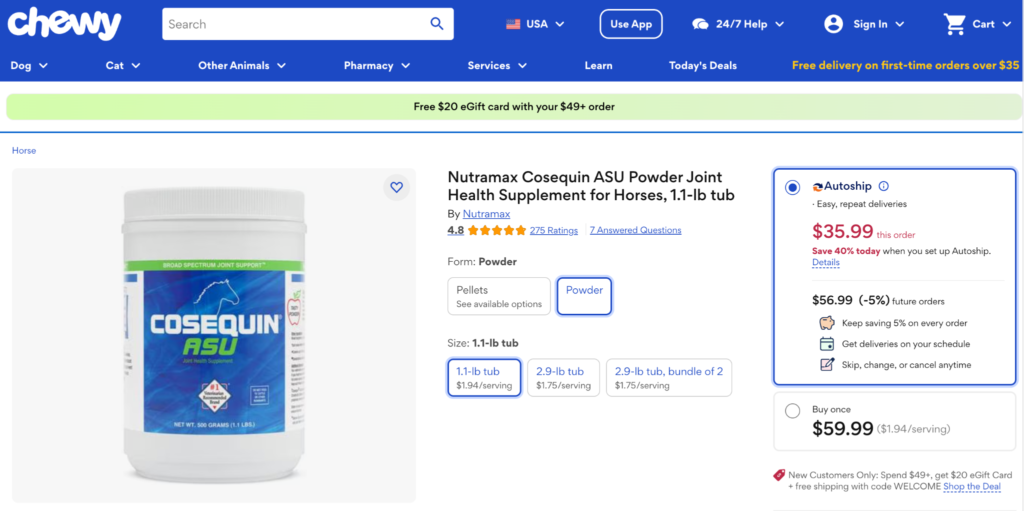
For example, Chewy’s Autoship has a micro-copy on every page that says ‘Free shipping’, ‘Cancel anytime’, etc., on all product pages.
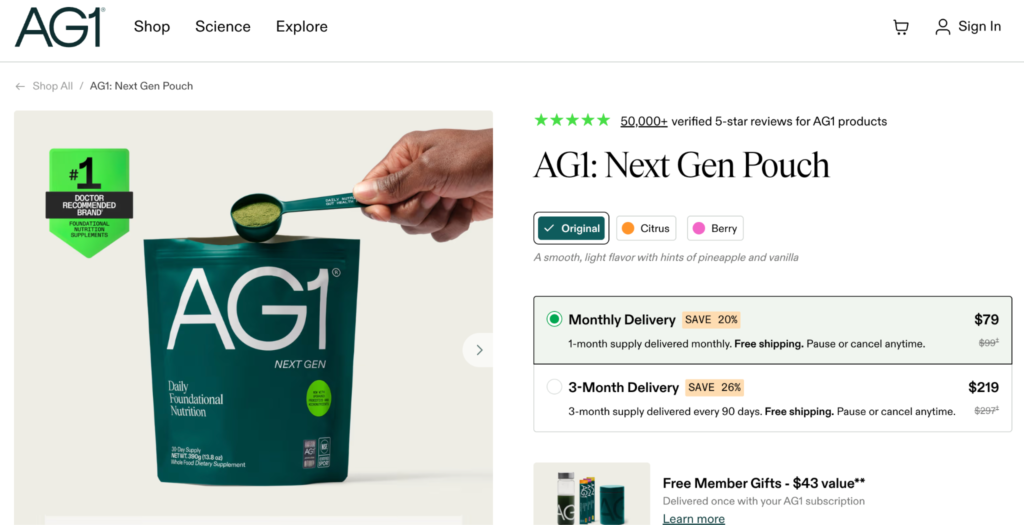
6. Limit visible options to 2 – 3 meaningful choices
According to Hick’s Law, the time it takes to make a decision increases with the number of choices available. For subscription businesses, this leads to abandonment. When you have too many plan options, customers might simply leave because they weren’t able to choose a subscription plan on your eCommerce site.
Many brands make the mistake of showing all plans – weekly, bi-weekly, monthly, bi-monthly, quarterly, etc. While your subscription app might be capable of offering these many plans, all your customers aren’t savvy enough to easily pick one plan. Most will abandon your site.
Here’s are some subscription UX best practices:
- Stick to the 2 to 3 options rule
- Track the most chosen subscription plans and offer those
- For example, 6-8 weeks, 1 month, and quarterly
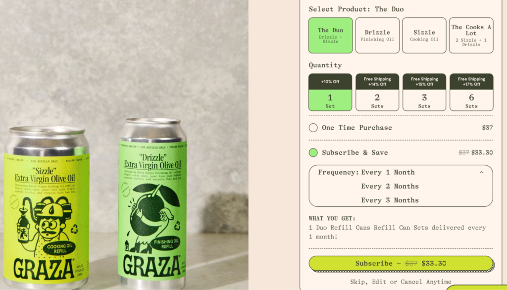
For example, Graza Olive Oil keeps it simple by offering 3 frequencies.
7. Allow easy correction post purchase
It is common for customers to choose the wrong plan. For instance, they’ll pick the monthly plan and realize they aren’t able to finish the stock. But this doesn’t mean they should feel stuck with the subscription or the only option for them is to cancel.
Make it easy for them to change the plan or delivery frequency. If it means they have to raise a ticket, wait for customer support, or go through a long and confusing process, they will choose to cancel. That is why, make it easy for them. Here’s how:
- A prominent “Manage My Subscription” link in every order confirmation email
- A subscriber portal that loads in 1–2 clicks, no login wall
- A clear, top-line option: “Change frequency” — not buried in a settings submenu
- One-click delivery date adjustment before each upcoming shipment
- A “Skip next delivery” button that doesn’t require cancellation
- A pause feature (1–8 weeks) that keeps the subscription active while the customer catches up
Wrapping up: Make it easy for customers to choose a subscription plan on your eCommerce store
To help your customers choose a subscription plan on your eCommerce store is not about giving them all the options possible. It is about giving them the right plans, and making the process of choosing simple and structured.
When you apply the right UX and design thinking keeping customers at the center, you can improve subscription conversion without feeling like you’re trying too hard.
To help you create an easy subscription selection structure, you’ll need a robust Shopify subscription app, such as Appstle Subscriptions.
Appstle Subscriptions is designed to help brands automate and benefit from intuitive features. The app allows you to set up multiple types of subscriptions, automate billing, cancellation management, marketing features, etc.
Install Appstle Subscriptions App in your Shopify store today!